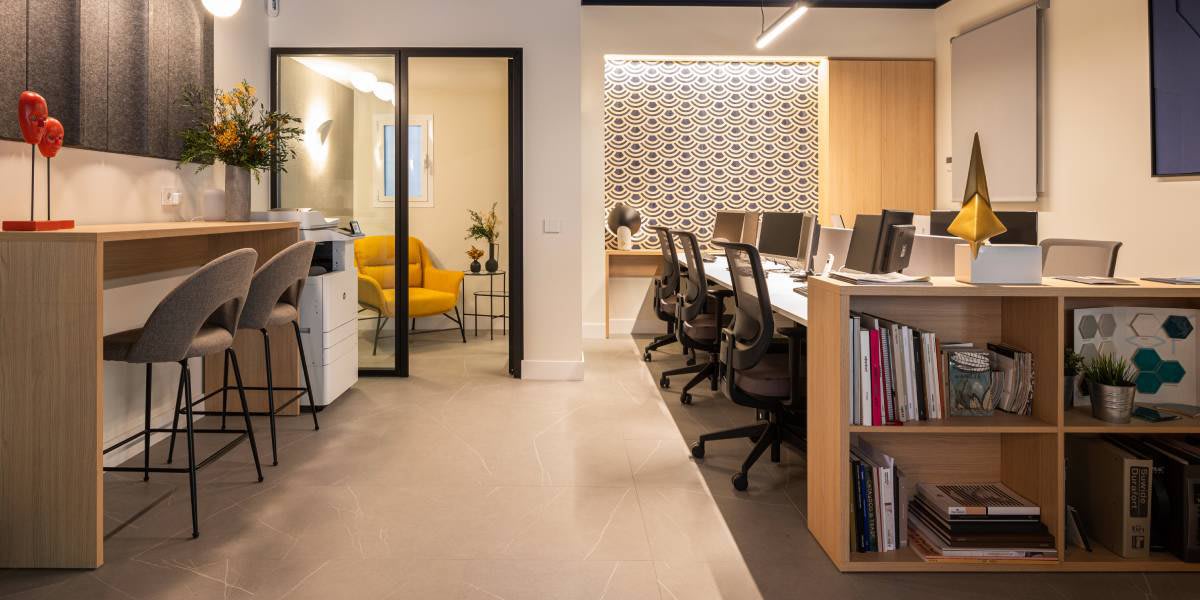
A design-centric office
It goes without saying that we all perceive colours in a different way and can feel drawn towards a diverse range of colour schemes at any given moment. And this is precisely what we’ll be going into in more detail here.
The dictionary entry for the word “colour” is
Go a little deeper into the subject of colour and you discover that Newton was the first (1666) to prove that colour does not exist (he discovered it by experimenting with a light beam passing through a prismatic glass). He observed that this was broken down into the six colours of the rainbow and that it is the reflections by objects that we actually perceive as a colour. So the important thing to remember here is that light alone is responsible for colour.
The human eye is capable of distinguishing between 10,000 different colours, so imagine the diverse colour palette we have to play with when it comes to interior design. But the most incredible part is what I mentioned at the beginning: colour depends on our perception, on our attitude and our mood, and therefore, we have to take into account our own individual personalities, which are inherent to our perceptions.
Translated to interior design projects, this means that when we choose the general colour scheme and the finer details related to different colour shades in each room, they must all be deeply linked to the client's personality. It means understanding their individual tastes to discover which colour will convey serenity, comfort, and a modern touch in their home.
I encourage clients to choose a neutral tone as a base that will enable them to introduce a more varied range of colours later without altering the overall atmosphere of the space. This could range from whites to greys or stone, which are all soft and timeless shades, and then introduce a more personal, contrasting shade of colour in the different elements of the room’s decoration, such as wallpapers or cushion covers and other fabrics.
In today’s world, when we define colour trends we look at four external factors: firstly, the social situation globally, which currently has a unique emotional framework due to the pandemic affecting us all. This translates into more sober colours. Then we’d look to the constant flux taking place in big cities, home to the largest proportion of the population, because these are the hothouse in which different trends are born, grow and very quickly become consolidated. This movement is represented by a range of more vibrant, happy colours. Another key role is played by fashion - the great barometer of these social changes in the big cities, which quickly incorporates new trends into its designs. And finally, Pantone, the universal colour guide, which also proposes the 'colour of the year' to be incorporated into the different elements that make up our lives.
So I would encourage you to go ahead and sharpen your perceptions and pay attention to what is happening around you, on the streets, in shop windows and in the big cities, as this will help you to anticipate and predict the colours that will set the season’s trends.
Cristina Carvajal, Retail Designer and Architect at Milimetric (www.milimetric.es)
When you purchase a new furniture item, mattress, kitchen, rug or curtain, you pay an eco-participation, which is used to fund the recycling of your old items.
What is eco-participation?
Eco-participation is an additional fee added to the price of new bedding and furniture, paid by the consumer and transferred to Ecomaison.
Why?
It is used to fund the sorting, recycling, and repurposing of old mattresses and furniture.
How does it work?
Ecomaison implements collection and recycling solutions in partnership with local authorities, social economy organizations (such as the Network of Recycling Centers and Emmaus), and furniture professionals.
Since 2013, through this initiative, Ecomaison has already handled over 10 million tons of used furniture and bedding, preventing the landfill of waste equivalent to 1,000 Eiffel Towers. Previously, 55% of discarded furniture ended up in landfills. Ten years later, it's less than 3%. With 800,000 tons per year, Ecomaison is now the leading supplier of recycled wood in France.
Who is Ecomaison?
Ecomaison is a state-approved eco-organization that manages the sorting, collection, reuse, and recycling of household items and materials, from the foundations to the finishing touches. Its mission is to collect and repurpose household items and materials, giving them a second life by donating, repairing, recycling, or using them as an energy source.
Find a collection point on the website ecomaison.com.
Some products are not longer available
If you want to continue please update your basket